Get to know us.
This is Dopamine.
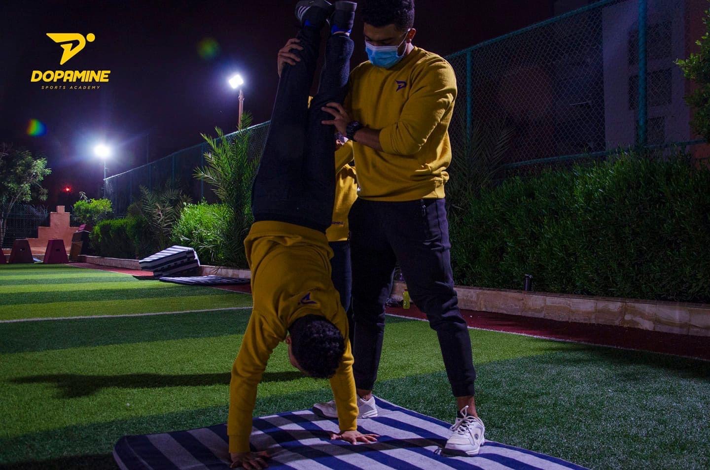
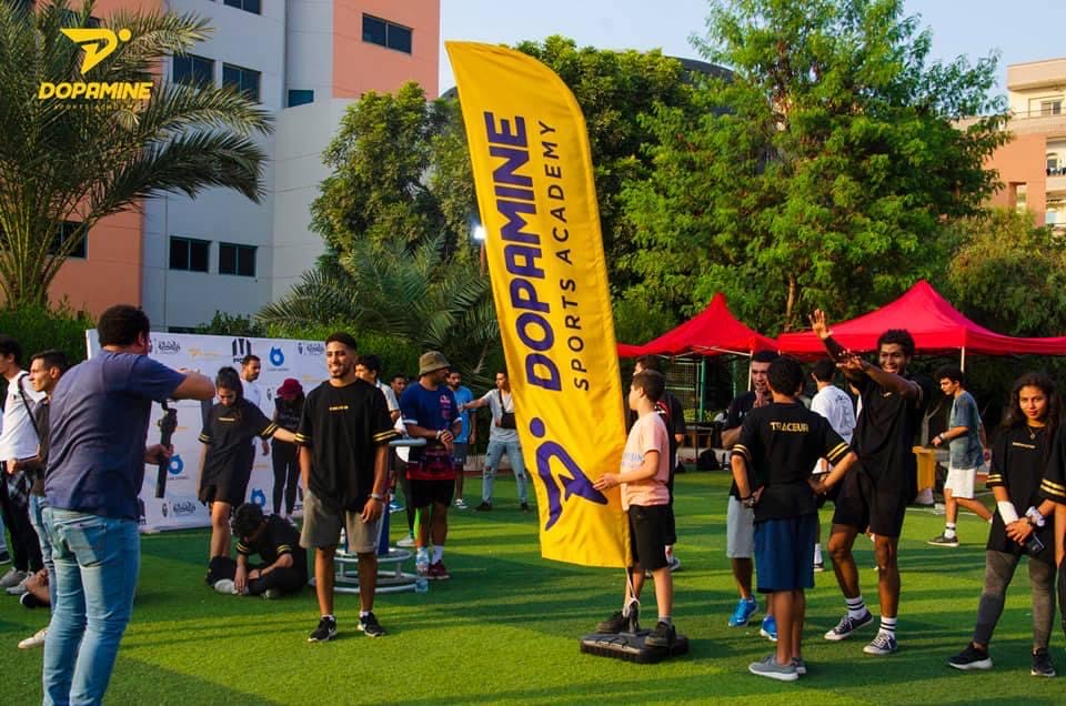
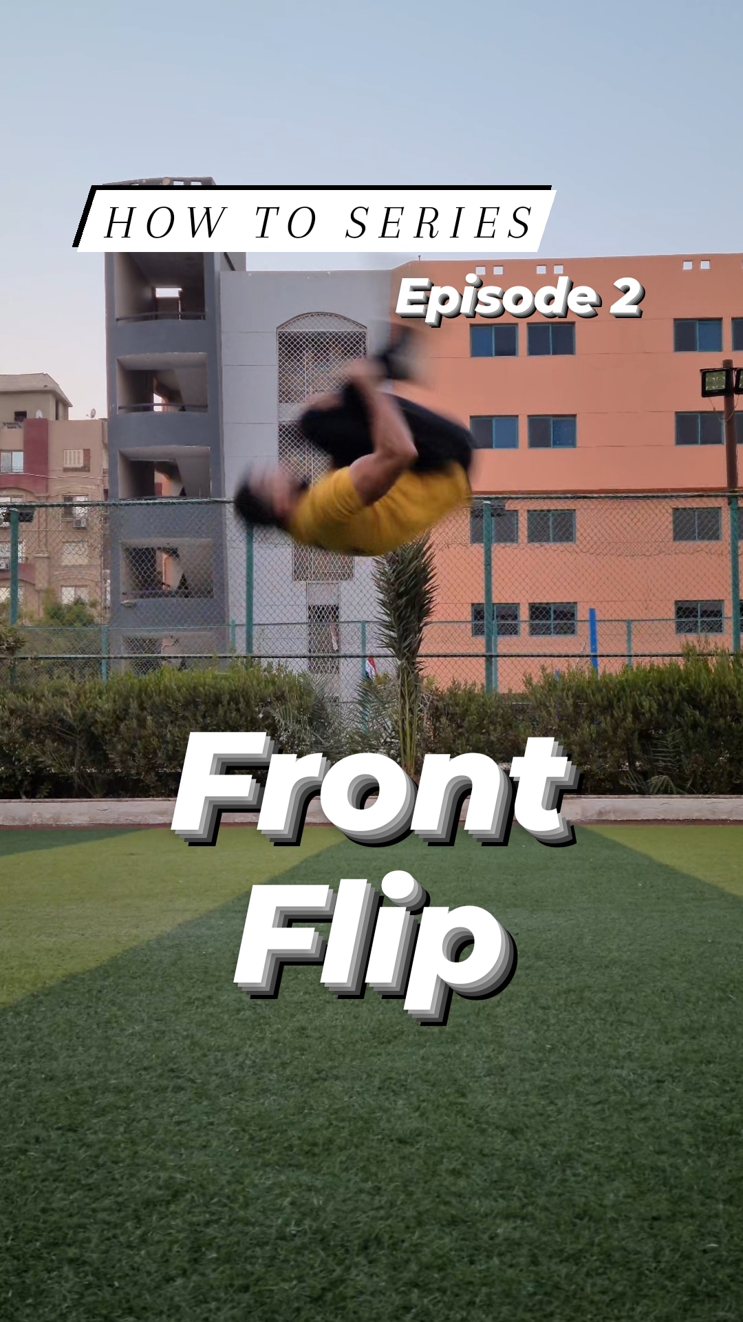
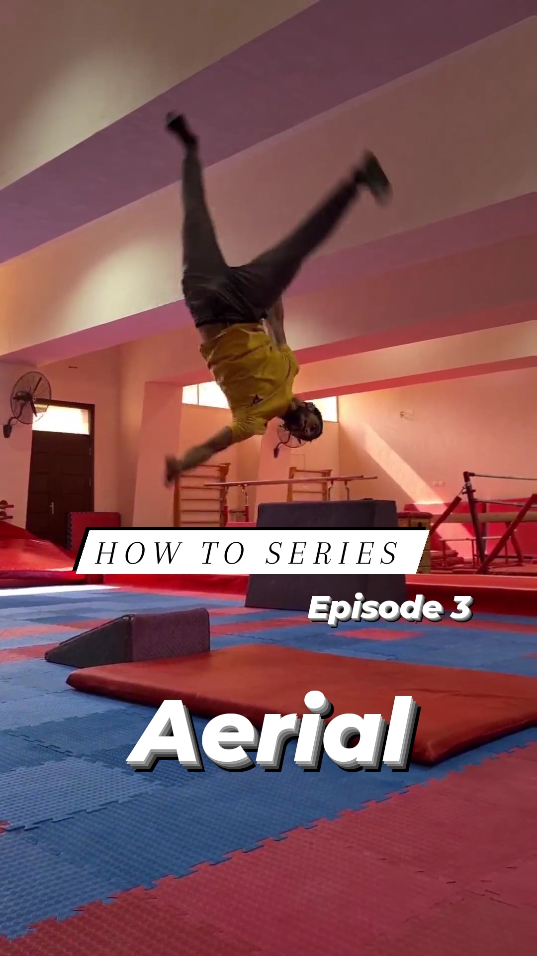
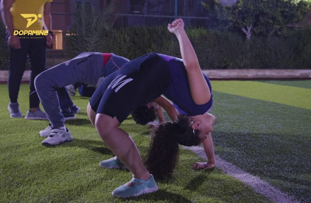
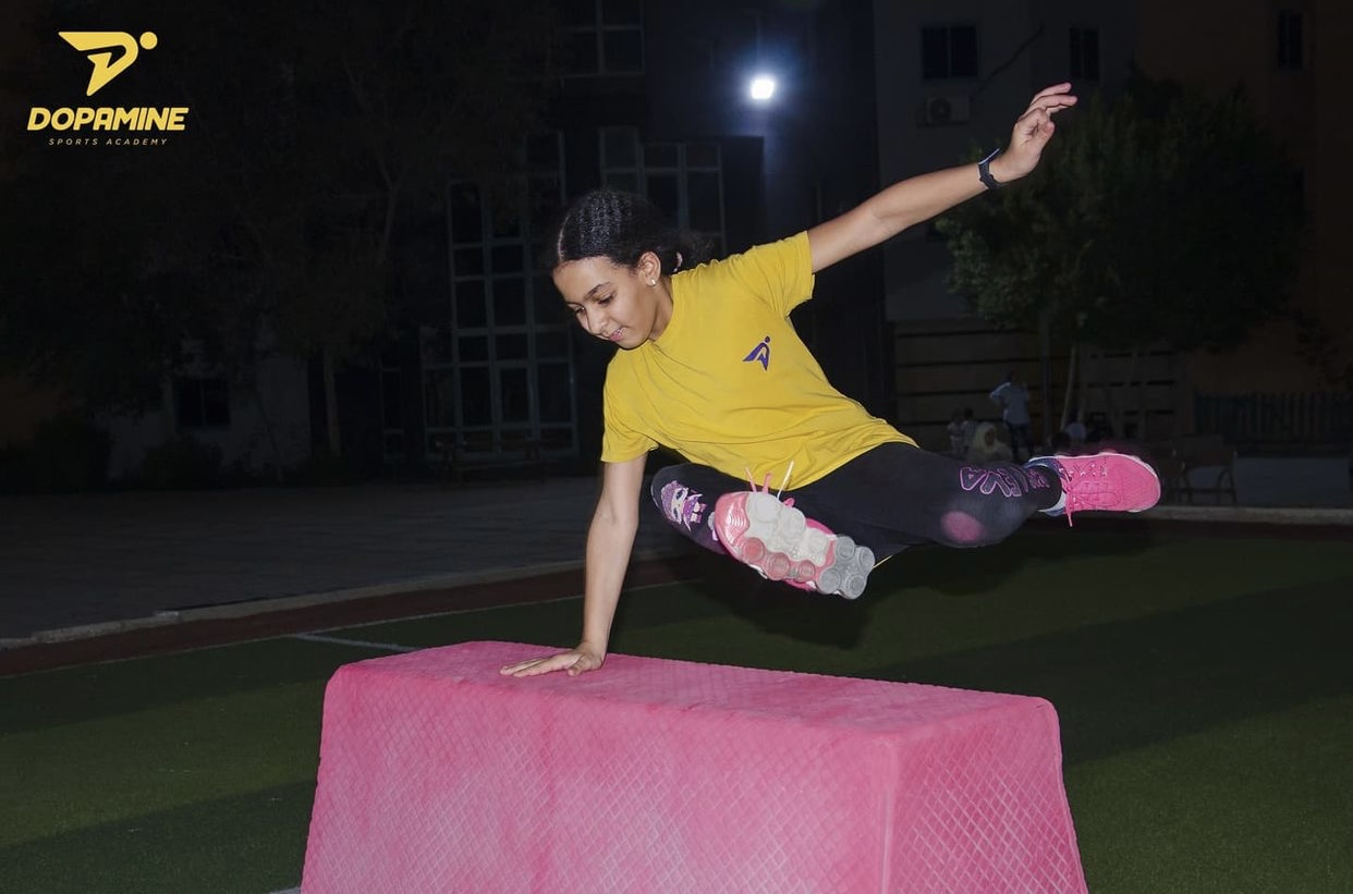
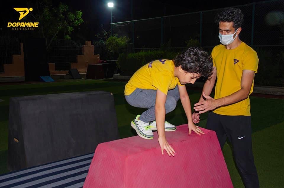
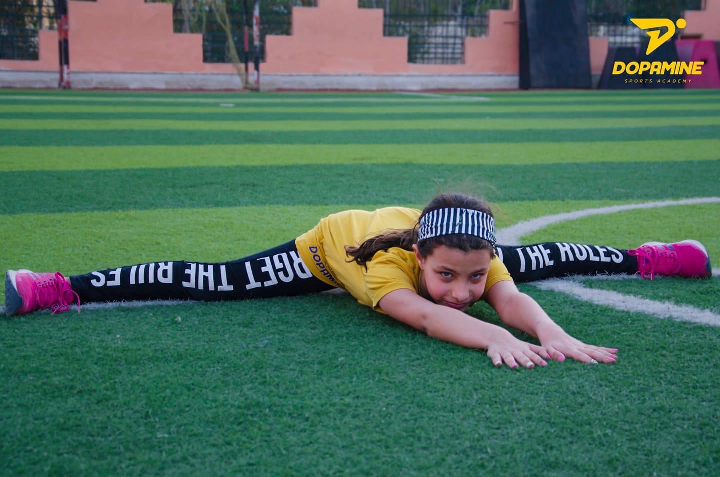
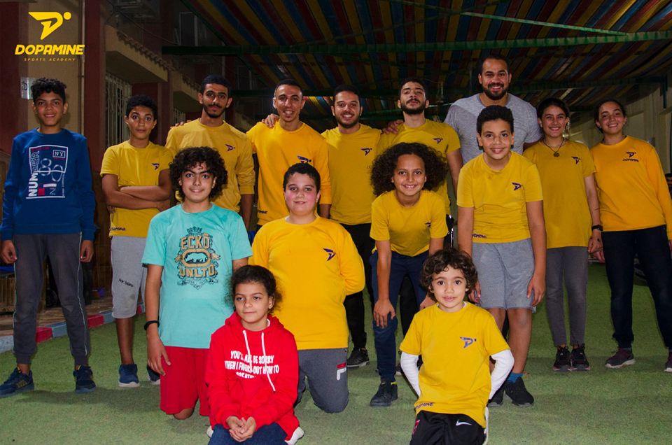
Our platform in Maadi assists student athletes to combine their life morals with sport. We strive to create a fun and a supportive community in the Parkour, Archery and Kung Fu classes that is provided either by us directly, or by our collaborative partners.
Most importantly, We Aim For Happiness!
Parkour
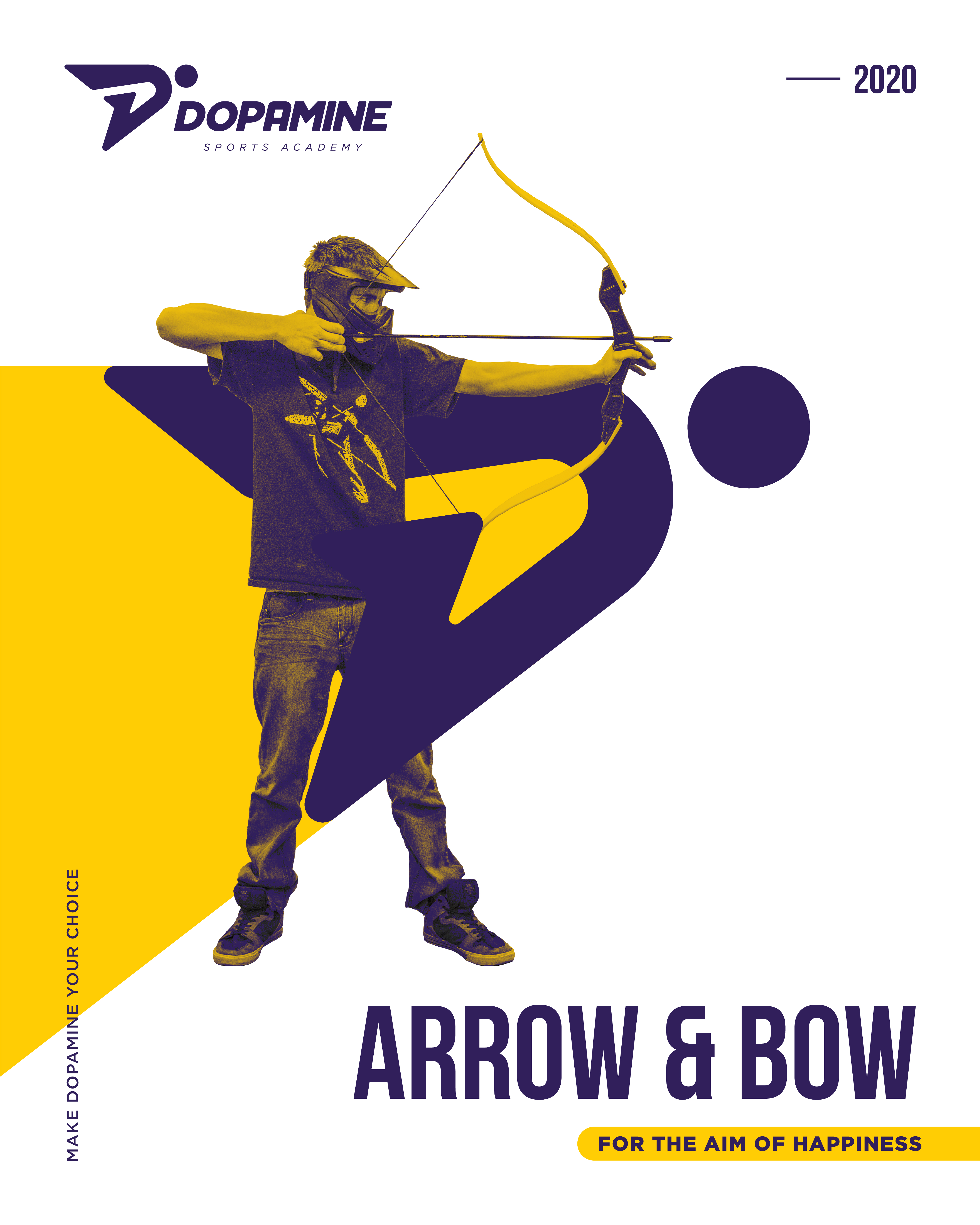
Archery
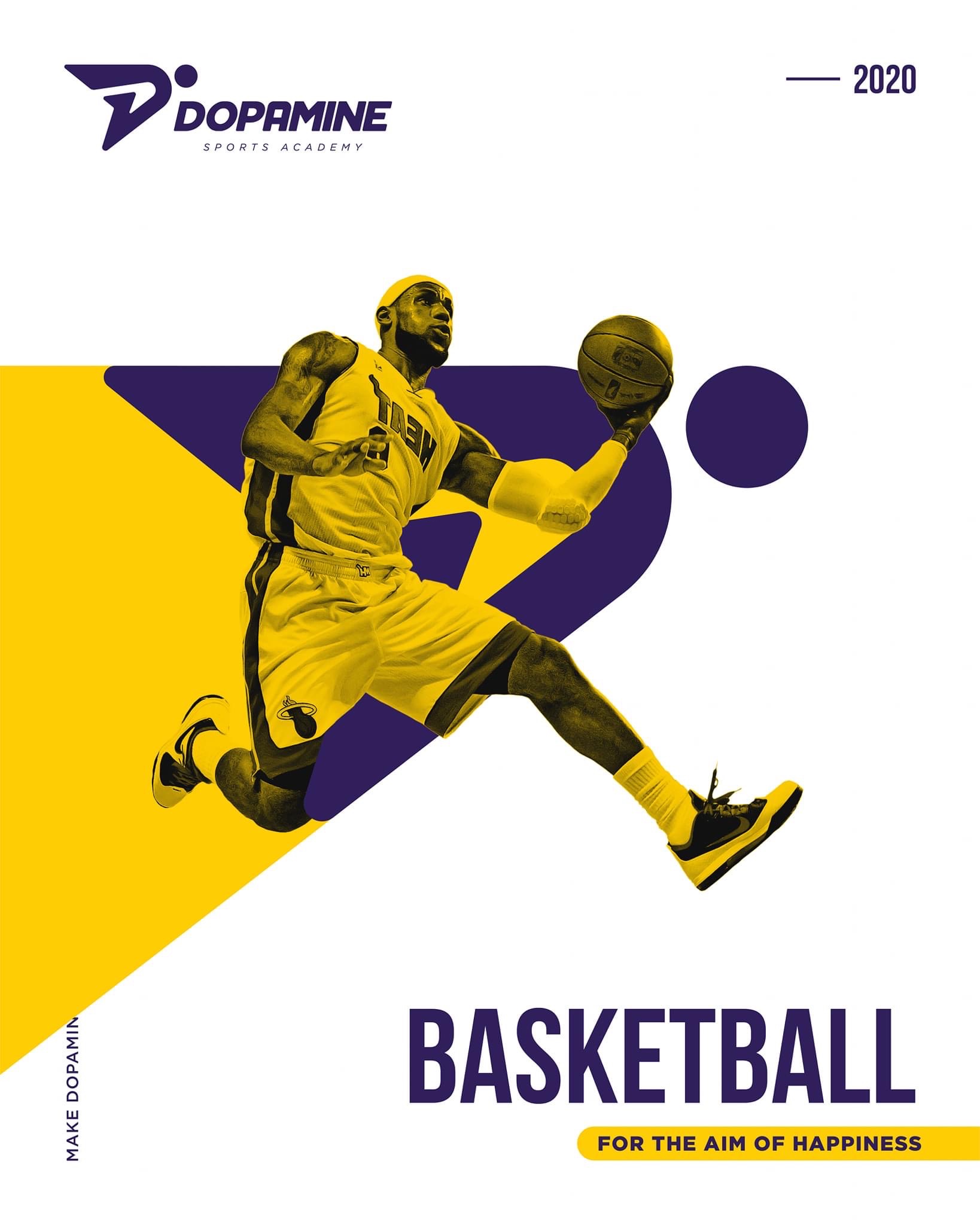
Basketball
Power of Motion
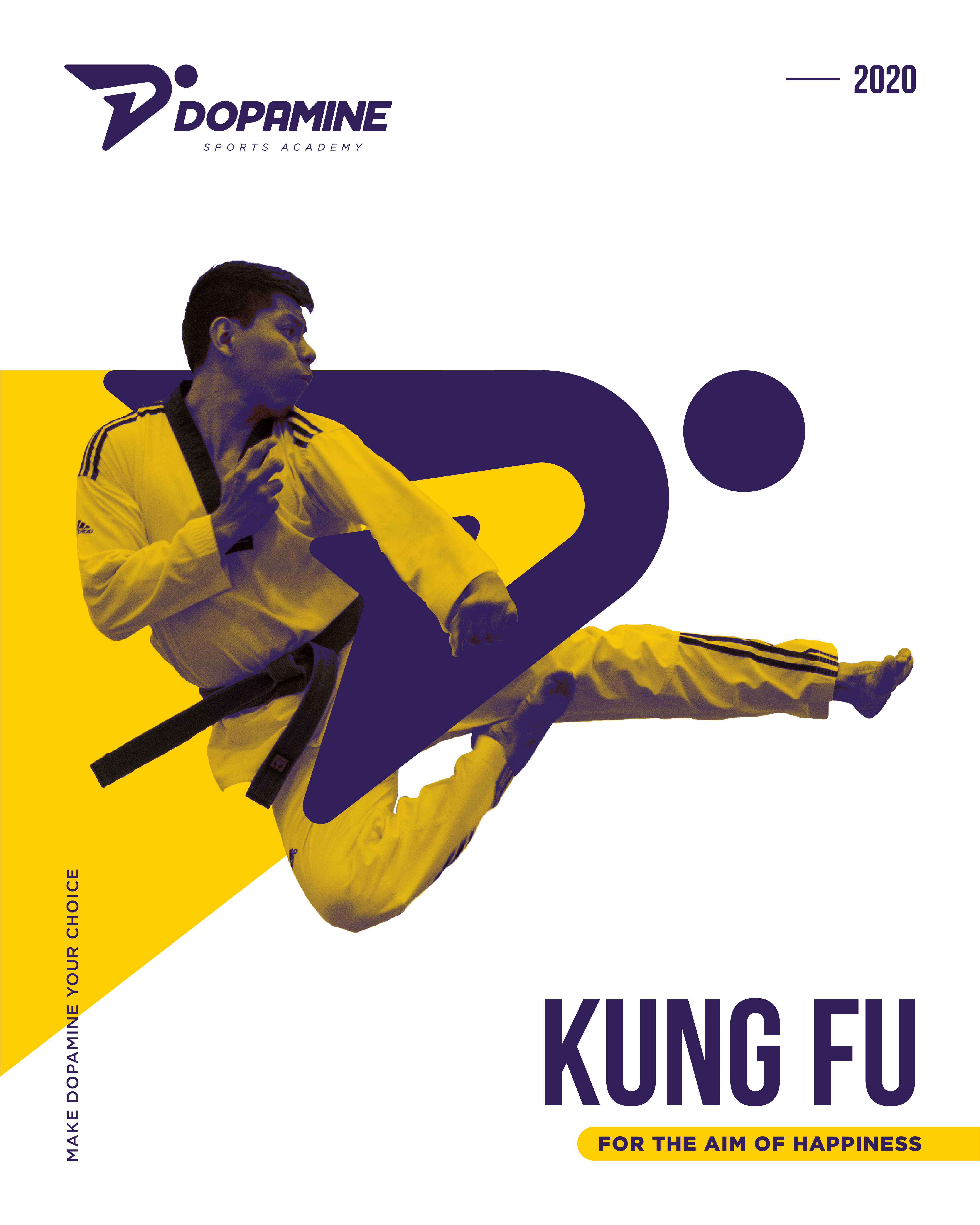
KungFu
Fitness
A Family Of Learners
We build heroes from scratch!
Be a part of our family now!
Years of experience has made hundreds of happy costumers, be one of them and share your experience with others.
Happy Clients
Events
Years of experience
Awards
Reflection
Check our Journey
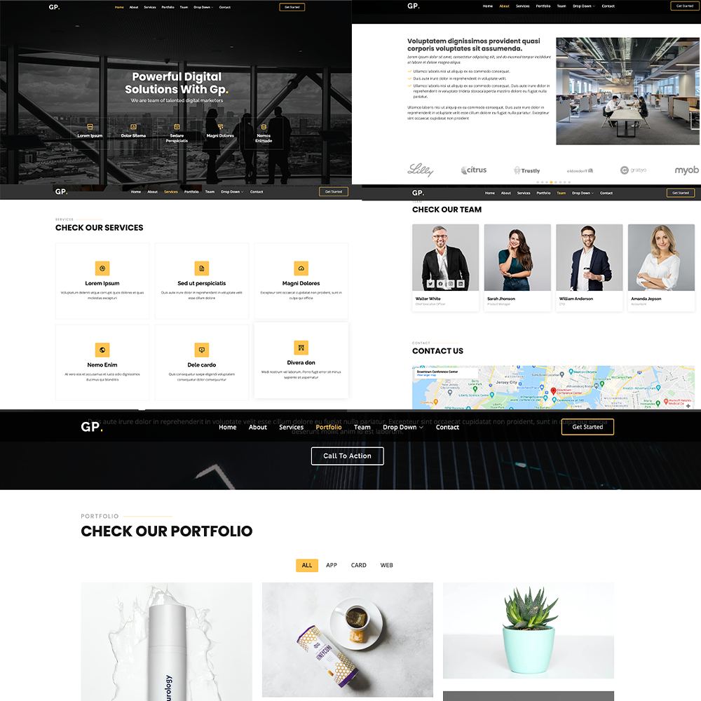
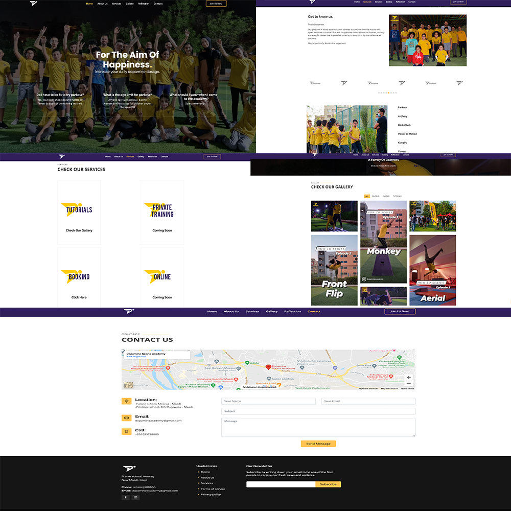
We started this project by choosing our client which is a sports academy that exists in Maadi and is called Dopamine. We then discussed how were we going to build a user-friendly website for them. We first decided the main pages that we were going to include in the website and we divided them on our team so each team member would get two pages. After that, we created lots of UX sketches and wireframes till we came up with the final pages’ design that we think are the most suitable for the academy. Our next step was to add the UI and animate the pages using Adobe XD. The UI part was quiet simple as like we mentioned earlier, the academy already existed so they had their own mood board and color pallet, we just had to add some materials as the pictures. We also used their two main fonts; Bebas Nue and Gotham. When we were done with the UI, we started to really learn the program that we were going to use; Adobe XD. We explored the program and searched for tutorials online and fortunately, they were easy to find. Mohamed took the services and the contact us pages, Reem took the home and the gallery pages and Mariam took the about us and the reflection pages. A hover state animation was the basic thing, any other animation such as changing color, 3d shadow effect, zoom when you click on an object, they were all steps that began with a hover state. Reem wanted the home page to look like a cool page with a modern scrolling to comfort the viewer’s eye and not to be boring. So, she added a picture that represents Dopamine academy, it had their identity colors and their logo on. Then as you scroll down, she added the sports they provide, each with a small picture to let the viewer know about the classes. The final step was the FAQ, and she kept it still because these questions are the most asked ones. As for the gallery page, Reem kept it simple to make sure it is entertaining for the viewer, so she did it as a loop, both for images and videos, where you can go to the next picture/video with just a tap on the right. Mariam on the other hand, kept the design and the animation very simple because these pages did not have lots of details. Some color changing buttons, that gets a bit bigger when you stand on, here and there and that was it. Facing the reality and making another version of the template we have chosen was a little bit more challenging as we did not stick to the template when we were first sketching, so our expectations were different. We wanted to improve the template to look like the sketches we have made as much as possible without having to add any other new pages. What we did was that we talked and decided to switch turns to allow each team member to look at another page as if it is completely new and to cut off the expectations they had regarding their previous page. An advice from an expert, a video tutorial on the internet and the www.w3schools.com website, these were some factors that helped us reach the level we are on now.
Contact
Contact Us
Location:
-Future school, Mearag - Maadi
-Privilege school, 8th Mujawera - Maadi
Email:
dopamineacademy@gmail.com
Call:
+201025788880
